
 n
nBuilding a Scalable Design System for Modern Web Development
Discover how a scalable design system improves consistency, speeds up development, and enhances collaboration using reusable components, design tokens, Storybook, and modern UI libraries. Learn the best practices for building maintainable, future-ready web applications.
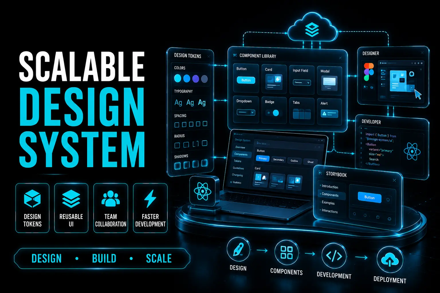
Introduction
As products grow, maintaining consistent UI and reusable components becomes increasingly difficult. A scalable design system provides a shared foundation that helps designers and developers build faster, improve collaboration, and deliver a consistent user experience across multiple applications.
1. Why Every Growing Business Needs a Design System
As organizations scale, inconsistent UI components create maintenance challenges and reduce development efficiency. A design system provides a single source of truth for reusable components, design standards, and development practices. It helps teams build faster while ensuring a consistent user experience across every product.
2. Collaboration Between Designers and Developers
A successful design system depends on close collaboration between designers and developers. Designers define visual standards in tools like Figma, while developers transform those designs into reusable components. This partnership ensures smooth design handoffs, faster implementation, and consistent user experiences.
3. Design Tokens: The Foundation of Consistency
Design tokens standardize colors, typography, spacing, shadows, and other visual elements across applications. Instead of hardcoding values, teams maintain a centralized token system that updates every product consistently. For enterprise projects, following the W3C Design Tokens Format improves scalability and collaboration across multiple applications. Popular design token tools include: Style Dictionary Theo Specify Diez
4. Building Components: Custom vs. Pre-built Libraries
When creating a design system, teams can either build components from scratch or customize an existing UI library. Popular options include: • Styled Libraries:Material UI, Ant Design, Bootstrap. • Unstyled Libraries:Radix UI, Headless UI, React Aria. • Semi-Styled Libraries:Chakra UI, Tailwind UI, Base Web. • Web Components:Styled Libraries:Stencil.js. Choosing the right approach depends on your project's flexibility, branding, and development requirements.
5. How to Choose the Right Component Library
As your design system grows, organizing and reusing components effectively is key to scaling. Wrapper components provide a flexible way to manage cross-cutting concerns like styling, state, or shared functionality while adhering to SOLID principles, particularly the Single Responsibility Principle (SRP). Before selecting a UI library, consider these important factors: • Customization capabilities • Design system compatibility • Accessibility (WCAG compliance) • Performance and tree-shaking support • Scalability for large applications • Community support and documentation • Styling compatibility (CSS, Tailwind CSS, CSS-in-JS) Selecting the right library reduces development time while supporting long-term scalability.
7. Maintaining Consistency with Storybook
Documentation is essential for a successful design system. Storybook acts as a central hub where developers can preview, test, and understand reusable components.. Storybook helps teams: • View live component examples • Understand usage guidelines • Test different component states • Maintain consistency across projects • Improve collaboration between teams This ensures every developer follows the same design standards without introducing inconsistencies.
Conclusion
A scalable design system is much more than a collection of reusable components. It creates a shared language between designers and developers, improves collaboration, reduces duplicated work, and ensures consistency across products. By combining design tokens, reusable components, Storybook documentation, and the right UI libraries, businesses can build scalable, maintainable, and future-ready web applications that grow with their teams.